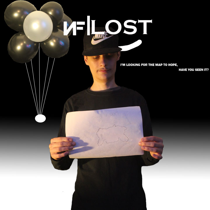
These two pictures are the final project pieces that I will be posting onto my social medias. The first picture being the main one to be posted but the more added one below is so that people know what the prop within the hand is.


These two pictures are the final project pieces that I will be posting onto my social medias. The first picture being the main one to be posted but the more added one below is so that people know what the prop within the hand is.
This first screenshot of the blog is showing that I am trying to add text which is from lyrics within a song from NF saying “I’m looking for the map to hope, have you seen it?”.

This screenshot carries on from the above screenshot, this time showing that I have used the move tool to under the album cover name “lost”. Although I didn’t say I was going to write anywords for this cover art, it seemed bare plus this text gives a better understanding of what the map is (prop being held up).

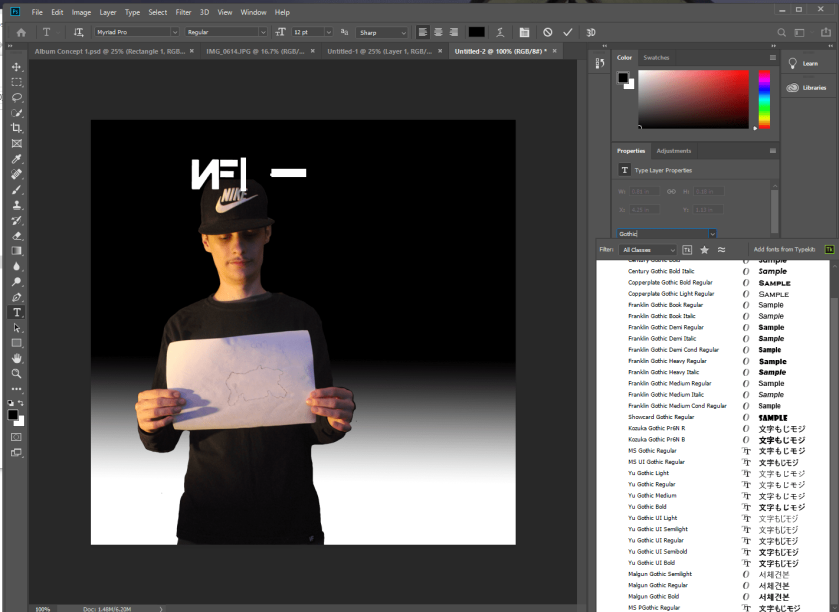
Within this screenshot below it shows me trying to play around on where the text should go, changing colours to match that of the background so the text is readable. I did this by this colour and chnaged the colour to black.

After messing around with the placements of the text I decided that it would be best above the concept art’s name. Again I changed the colour to white so that the text is readable to the background.

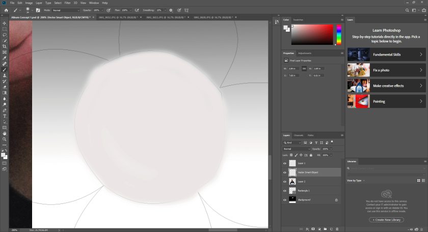
From the above screenshot I decided that the hand being cut off doesn’t look quite right next within the album art. Using the lasso tool I went around the balloons within a different document and placed this over the hand so it hides the cut of the hand.

As I used a different resource for the model to hold the balloons from, I thought it would be better to create something that makes the baloons look like they are being stood up. To start with I used this tool that creates a few shapes, in this case I clicked on the elipse tool that created the shape just below the balloons. From there I picked the line tool.

From clicking on the line tool I made many lines that went from the elipse shape to the balloons. The idea for this coming from other art that NF has used within “The Search” art for songs.
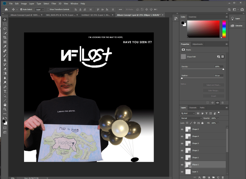
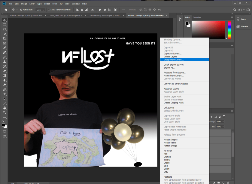
Following creating this balloon aspect they were all their own layers. So, if I needed to move this area then I could with grouping the layers alogether.
As I didn’t think the above final fan made album concept art wasn’t good enough so I decided to create another album concept. Following the NF logo being ready I put this in with the rectangle that splits the logo frm the name of the concept album art. Instead of drawing the “lost” theme to “Paid My Dues” I looked into the Gothic font which was a decision helped from research into fonts. Using the same technique as the previous concept, I used the lasso tool to go around the model. This time I was able to go a little more centre because everything is there and not cut like the other picture.
I then added the similar balloon holder as the previous album concept, only this time the lines are white.

This being the final album concept ready to engage other fans within the chosen social media platforms. From the above screenshot to this picture below I have added text, shown in previous screenshots, that gives the audience a better idea of what the map is.
Following research into the dimensions that are allowed on Twitter to research into typical album concept sizes. So from the album sizes I saw that in brackets there is dimensions of 10 inches by 10 inches as the recomendation so this is what this screenshot below is showcasing within the right part, ready to create the document.

After creating the document I got into making the background for the album concept. From the start of the project I said this background would more than likely be black but after using the gradient tool I thought this would look better rather just one primary colour.

Following creating the NF logo within Affinity designer I was able to get this ready to go straight into the album concept. As I didn’t want the white areas as it is going over the black part of the background I used the lasso tool. The lasso tool allows to added extra material that isn’t wanted/needed to be removed, used by going round an area but also meeting back before pressing delete. This is what this screenshot below shows.

I dragged the NF logo into the album concept production document and tried to centre it similar to the four album arts that has had research into was the inspiration. Following centring up the logo I used a shape tool to get that long rectangular shape to the right of the logo which again is inspired by research conducted into the artists. Using the pen tool I then tried to match the font used in the “Paid My Dues” video with the smile too but didn’t feel like this would work well as it is too large.

After deciding that I didn’t like writing of the first attempt of “lost” I retried it over and over until it was a little more centre but also the closest to the font used within the “Paid My Dues” with the smiley face included. After creating what is the main factors I started to playaround with some of the pictures on which ones would work better but from research into album art sizes it says to make sure none of the props or person is just cut off so this image below doesn’t work, using the lasso tool to remove excessive amount of material that isn’t needed.
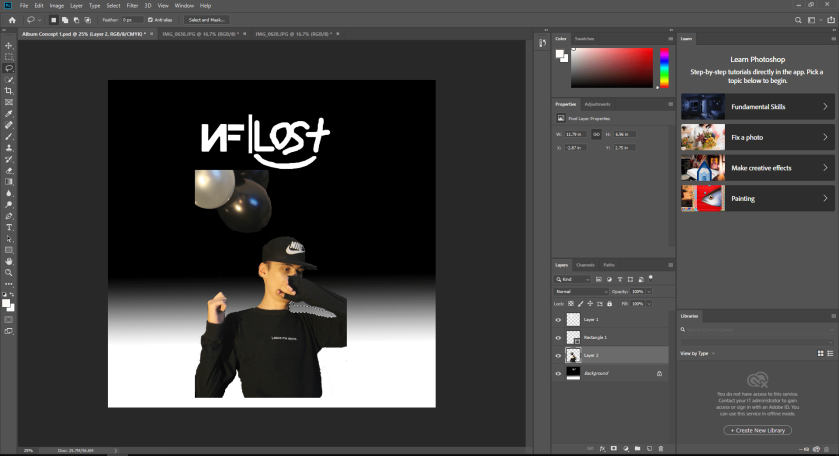
This screenshot below shows again the proccess in which I am trying to decide on the pictures that I want to use which best fits without the arms or hat being cut of due to the pictures took within the production phase too. In this case I liked this one because the map is showing and the face is hidden like I was talking about within the idea blogs.

This screenshot below is showing me trying to create a what should be balloons. I had tried to go around the balloons in affinity design then tried to colour them within Photohop but this didn’t work and slightly after this screenshot it was deleted.
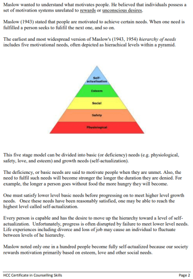
This theory delves deeper into what people are most motivated by. Within this first triangle the main things that Maslow found to be the motivation are physiological, safety, social, esteem and self-actualisation. He found that the main things being the self-esteem, love and other social needs but not in that order.
Physiological is based around air, food, drink, shelter, warmth, sex and sleep which most of these names are basic human needs like food, drink, air and so on. Safety needs ranging from security, order, law, limits, protection from elements, freedom from fear and stability which are the main words that would be thought off with hearing the word safety. Social needs are mainly things like relationships ranging from love, friends, family and work groups but that is because a person whats to feel a sense of belonging as well as affection and love. While esteem needs are about achievements from work or within personal life whis can lead to independence, status, self- respect, respect from others meaning you are dominating but also mastering your work/private life. Self-actualisation is when a person realises their potential, seeking personal growith and peak experiences.

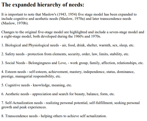
From the areas talked about further above the hierachy of needs from the above screenshot with added reasons. Things ike cognitive needs, aesthetic needs and transscendence needs. Cognitive needs being the knowledge that has been gained as well as the meaning towards the things you do or to life within general. Aesthetic needs is the appreciation and search for beauty as well as balance andfor. Transcendence needs is when a person is trying to help others reach self actualisation.

This screenshot looks into the characteristics of self-actualised people. This mainly a way of how these people live in every day life but also what they live by regularly. This could tie in with this project because of the way people act but also the characteristics that would make them interested within my work. If the characteristics need to be talked about within another blog then I will use this part of this blog to find the similar ones that relates to the audience for my work.


McGuire, K. and Maslow, A. (n.d.). Maslow’s hierarchy of needs.
Highgatecounselling.org.uk. (2019). [online] Available at: http://highgatecounselling.org.uk/members/certificate/CT2%20Paper%201.pdf [Accessed 16 Dec. 2019].
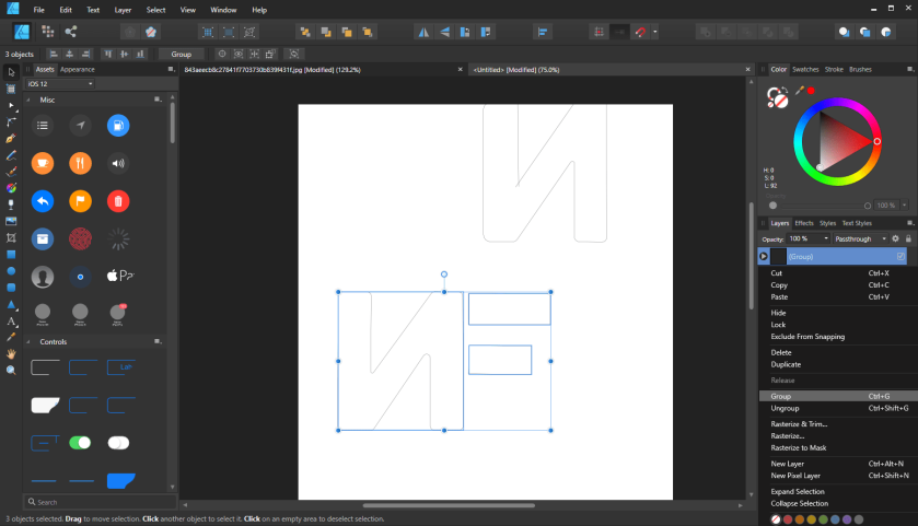
Here I am using the logo that I got from secondary research shown in previous blogs. I added this into a new tab on Affinity Design where from there I started to use the pen tool to go around the logo the best I can.

When I had finished this I pressed shift and clicked on the two lighted areas to the right called “curve”. Unfortunately I didn’t get a screenshot of me grouping these together but again I pressed shift and left clicked on the mouse where I was given a list to pick from and I clicked group.

Having grouped the “N” I moved it to a new document where I want to use what looks like the bow and arrow tool to curve the corners. Following trying to do this with my try of this “N” it didn’t quite work out.

Repeating the same process as before apart from I made sure I carried on and not creating another curve to make the same mistake as the previous “N”. Using the tool this is the options that come up and when curving the corners there is a red circle that comes off allowing me to know how much that corner has been curved.

This is the final way in which the “N” looks from using the curving tool. I realised the N needed a little more straightening which I did as some off it isn’t at all even.

Using the technique with the pen tool like done with the “N” I created these two blocks to create the NF. Then from there I grouped them together so I can move it all at one if I need to when editing the album concept in a few weeks.
In the production phases I will use this logo in the same manner in which is used in the official album releases and within that time I will decide if this will still be white or have a filling depending on other colours used.
![]()
